Tuesday 14 July 2015

18 useful articles to improve your design process

Credit: Jenni Brown

Improving your design process makes all the difference to your efficiency, your clients’ happiness, and your own motivation.

The more time you can save with design shortcuts the better, so we’ve dug out some of the best resources on the web to help you saving time creating websites.

Why Prototyping is Essential to Your Design Process

“Things we conceptualize in our heads that seem awesome regularly turn out to be terrible ideas when we put them in a more concrete, visual medium such as a piece of paper or a computer screen.”
improve-your-design-workflow

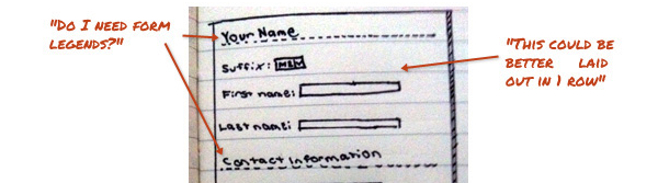
Logo land: a terrain of twists and turns

“At the outset, the job is investigative; with detective hats on, the creative team researches, asks questions, analyzes the target audience, scrutinizes competitors, and brainstorms. The process then moves from factual to conceptual, with creative inspiration coming from any number of sources until it finds its way to paper.”
improve-your-design-workflow2

Designing A Winning Navigation Menu: Ideas And Inspirations

“It is better to use simple, obvious and terms that are easy to figure out than to keep to industry-only terms for your navigation menu. Any link that takes users more than a second or two to figure out is probably unsuitable for use.”
improve-your-design-workflow3

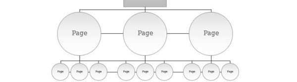
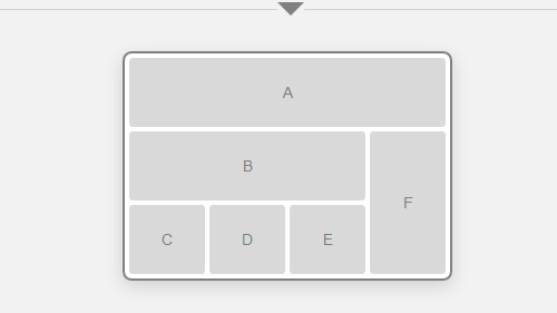
4 tricks for designing data-heavy applications

“Define a use case that will guide your design process. How do most people use your tool? Understand that you cannot please every single user. As a designer, your aim should be to provide the best tool for most of your users, most of the time.”
improve-your-design-workflow4

Top 10 Must Have iPad Apps for Logo Design

“The job is tough undoubtedly and to make the job easier a bit various logo design apps have come up to the world of logo designers to help them work whenever and wherever they want in a more effective manner.”
improve-your-design-workflow5

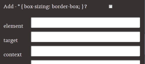
Basic Ready-to-Use CSS Styles

“When you’re creating a website or an application from scratch, you may need a collection of patterns helping you building thing up.”
improve-your-design-workflow6

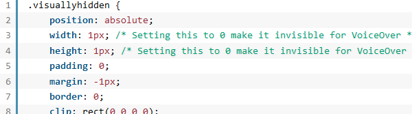
How to deliver the perfect design

“Some of us make our living off doing client work and accepting new projects. While all of us are different in the amount of work we can do and handle, it’s no secret that we don’t want to spend lots of unnecessary time stuck doing revisions and trying different designs.”
improve-your-design-workflow7

Useful Photoshop Tools and Techniques For Your Workflow

“Photoshop is an extremely powerful application for photo processing and image manipulation, and we can make it even more powerful by using handy tools, actions, plugins and templates to save time for solving mundane regular tasks. The better our professional tool set is, the more time we can spend to focus on the actual design process rather than the tool we are using to implement it on screen.”
improve-your-design-workflow8

Developing a Design Workflow in Adobe Fireworks

“...with so many choices, how do we determine the right tool to move from concept to functional design?”
improve-your-design-workflow9

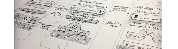
10 Ways Photoshop Actions Can Improve Your Workflow

“Photoshop actions are an extremely easy way to automate all of the mundane daily tasks that have made their way into your design workflow.”
improve-your-design-workflow10

Five Steps to Improve Your Design Process

“Design is often thought of as an artistic, intuitive activity. It isn’t really that at all – at least few targets think of it that way.”
improve-your-design-workflow11

5 Tips to Improve Your Design Sign-Off Process

“Unfortunately, everyone has a different opinion about what “good design” actually is. This is a problem if you’re creating products, software, graphics or other media for a client. Your design may need to be agreed by multiple people all with their own notions and prejudices about how the product should look, feel and work.”
improve-your-design-workflow12

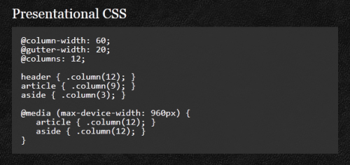
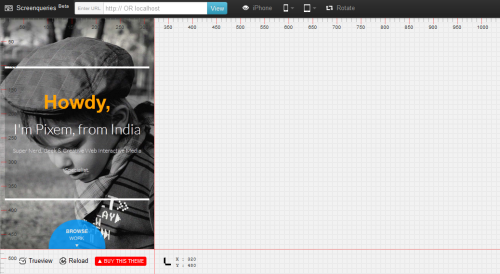
Our responsive web design workflow - caplin.com

“What we know about our users viewport resolution this month my be vary different to what we find out next month. Responsive websites should be flexible and perhaps a bit freeform – but so should the design process.”
improve-your-design-workflow13

5 Ways To Streamline Your Web Design Workflow

“As a freelance designer, my income greatly depends on my ability to produce quality work, and if I can do that even slightly faster than the other guy, I will not only have happy clients, but returning customers. In this post I’d like to share some of the things I’ve learned throughout the years that I use or do on a daily basis to help me with my workflow.”
improve-your-design-workflow14

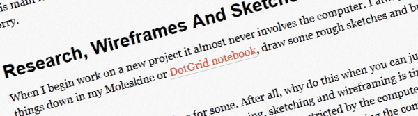
6 Web Design Workflows That Work

A collection of great articles on proven web design workflows.
improve-your-design-workflow15

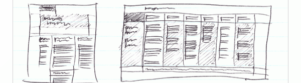
Optimise your web design workflow

“I’m not sure about you, but I still favour using Photoshop to create my designs for the web. I agree that this application, even with its never-ending feature set, is not the perfect environment to design websites in. The ideal application doesn’t exist yet, however, so until it does it’s maybe not such a bad idea to investigate ways to optimize our workflow.”
improve-your-design-workflow16

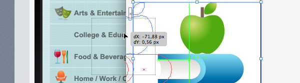
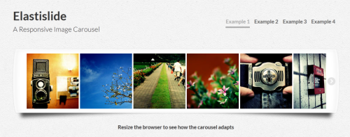
Responsive web design workflows for today’s web

“It is the nature of the web to be flexible, and it should be our role as designers and developers to embrace this. – John Allsopp”
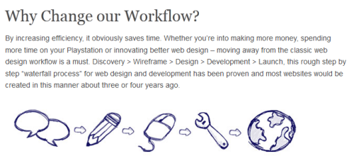
improve-your-design-workflow17

Responsive workflow

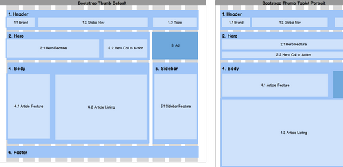
“About three or four years ago—when I mostly did just static width sites—my projects went through the different phases in the order illustrated below, which looks like a typical waterfall process. Back then there wasn’t much room for revisions, and what clients saw were either the wireframes or almost finished Photoshop designs.”


improve-your-design-workflow18

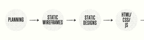
For more information about working in the design sector or if you would like to hire a designer, please contact us.

Conquest UK
Web: www.Conquest.uk.com
Email: Advice@Europe.com
Tel: 0871 910 0002
Calls cost 10p per minute + access charge

Connect
Conquest on Facebook
Conquest on Twitter
Conquest UK Google+
The Conquest UK Group Google+

Credit: Jenni Brown

Improve your responsive website design skills - 40 articles and resources!

Credit: Jenni Brown


Responsive design has been around for a few years now, and we can’t see it disappearing off the radar anytime soon.

With that in mind, here’s a list of 40 of the most interesting articles and resources we’ve found to help you improve your responsive design skills and knowledge.

Whether you’re just starting out or you’re perfectly comfortable with the principles, there’s bound to be something here for you to get your teeth into.
Enjoy!

Style Tiles

“Style Tiles are a design deliverable consisting of fonts, colors and interface elements that communicate the essence of a visual brand for the web.”
responsive-design-resources13

Gridpak

A fantastic responsive grid generator to make responsive design easier.
responsive-design-resources20

Sketchsheets for responsive web design

A big list of sketchsheets and tools you can use to draw out your designs in various resolutions for a range of different devices.
responsive-design-resources

How to develop a responsive workflow

“With the introduction of RWD, it is vital that we as designers evolve our workflow to better suit the demands of the new web. Many of us have voiced our frustrations on how Photoshop’s fixed pixel approach is unsuitable for designing the fluid layouts needed for a responsive website but no useful alternatives have been offered.”
responsive-design-resources2

Adobe Edge Inspect

A handy tool for testing designs in different settings.
responsive-design-resources3

Responsive web design with physical units

“This post should be titled “Getting Ahead of Yourself.” “…By a Few Years,” actually. Here’s the deal: at the time I’m writing this, early 2013, there’s no way to accurately design for the Web using physical units, nor will there be for a very long time. But there is a way to design while knowing the physical characteristics of the device — or, at least, there will be in the very near future.”
responsive-design-resources4

The responsinator

See what your website looks like in different resolutions in real time.
responsive-design-resources5

Responsive web design workflow considerations

“...as designers and developers how do we optimize our workflow efficiently? Just as responsive web design is evolving continuously, so will the responsive web design workflow.”
responsive-design-resources6

Responsive web design workflow considerations

Resize your browser to match popular devices (or choose your own size) quickly and easily.
responsive-design-resources7

Responsive design breakpoints

A short explanation and outline of breakpoints in responsive design.
responsive-design-resources8

Mixing responsive design and mobile templates

“You need a mobile strategy for your site. You have to pick Responsive Design or a dedicated mobile site, right? Maybe not. Maybe you can mix and match a variety of strategies.”
responsive-design-resources9

Responsive admin templates

A selection of fantastic responsive templates for admin panels and backends.
responsive-design-resources10

Responsive design: the problem with mobile ads and how it can be overcome

“But while there are many benefits to using responsive design, there are still major problems to be overcome in regards to advertising. At the moment ad formats are generally incompatible with responsive design, forcing site owners to either find hacks to rescale them or hide the ads altogether on mobile screens.”
responsive-design-resources11

The new rules of the responsive web

“As responsive web design gained steam, the way we build websites changed. As the term moves from buzzword into a common part of every web design project, the way we work as web professionals needs to change. With this in mind, we need to lay some new ground rules for how we work.”
responsive-design-resources12

Foundation

An excellent framework for responsive design.
responsive-design-resources14

The responsive calculator

“Just a simple calculator to help turn your PSD pixel perfection into the start of your responsive website.”
responsive-design-resources15

Adaptive images

“Adaptive Images detects your visitor’s screen size and automatically creates, caches, and delivers device appropriate re-scaled versions of your web page’s embeded HTML images. No mark-up changes needed.”
responsive-design-resources16

Responsive design with mockups

“Many Mockups users are doing responsive layouts on their projects or are planning to. We’ve been talking with the Balsamiq community about how Mockups can work with responsive web design concepts, and we thought we’d explore some techniques that might help.”
responsive-design-resources17

Picture fill

“A responsive images approach that you can use today, that mimics the proposed picture element using divs, for safety sake.”
responsive-design-resources18

Seamless responsive photos grid

“Let’s say you have a bunch of images you want to display, and the goal is to get them edge-to-edge on the browser window with no gaps. Just because you think that would be cool. They are of all different sizes. You don’t care if they are resized, but they should maintain their aspect ratio.”
responsive-design-resources19

The semantic grid system

“Page layout for tomorrow. Set column and gutter widths, choose the number of columns, and switch between pixels and percentages. All without any .grid_x classes in your markup.”
responsive-design-resources21

ProtoFluid

“Rapid prototyping of fluid layouts, adaptive CSS and responsive design.”
responsive-design-resources22

Building a better responsive website

“Earlier this year, I was in the beginning stages of a redesign for our company’s website. We had already been planning to use a straightforward responsive approach to Web design, which is our preferred solution for multi-device support…”
responsive-design-resources23

Overthrow: An overflow polyfill for responsive design

“Overthrow.js is a conservative attempt at filling the gaps in overflow support, with an emphasis on letting native implementations do their thing, and ensuring a usable experience in all browsers.”
responsive-design-resources24

Isotope

“An exquisite jQuery plugin for magical layouts.”
responsive-design-resources25

Elastislide

“Elastislide is a responsive image carousel that will adapt fluidly in a layout. It is a jQuery plugin that can be laid out horizontally or vertically with a pre-defined minimum number of shown images.”
responsive-design-resources36

jQuery Masonry

“Masonry is a dynamic grid layout plugin for jQuery. Think of it as the flip-side of CSS floats. Whereas floating arranges elements horizontally then vertically, Masonry arranges elements vertically, positioning each element in the next open spot in the grid. The result minimizes vertical gaps between elements of varying height, just like a mason fitting stones in a wall.”
responsive-design-resources26

FitVids.js

“A lightweight, easy-to-use jQuery plugin for fluid width video embeds.”
responsive-design-resources28

Susy: Responsive grids for Compass

“Susy is based on Natalie Downe’s CSS Systems, made possible by Sass, and made easy with Compass. You can use it anywhere, from static sites to Django, Rails, Wordpress and more.”
responsive-design-resources27

Responsivepx

“Enter the url to your site - local or online: both work - and use the controls to adjust the width and height of your viewport to find exact breakpoint widths in pixels. Then use that information in your media queries to create a responsive design.”
responsive-design-resources29

SimpleGrid

“Responsive. Infinite nesting. One class per element. Simple.”
responsive-design-resources30

Responsive website design testing tool

“This tool has been built to help with testing your responsive websites while you design and build them.”
responsive-design-resources31

Tiny Fluid Grid

“The happy & awesome way to build fluid grid based websites.”
responsive-design-resources32

Responsively retrofitting an existing site with RWD Retrofit

“The most important question on everyone’s mind — clients and developers alike — is, “How can we provide a great Web experience to our users on mobile?””
responsive-design-resources33

Screenqueries

Test your website’s responsiveness.
responsive-design-resources34

Blueberry

“Introducing a jQuery image slider written specifically for responsive web design.”
responsive-design-resources35

Responsive slides

“Simple & lightweight responsive slider plugin (in 1kb).”
responsive-design-resources37

Responsive wireframes

“Responsive layouts, responsively wireframed. Made with HTML/CSS, this is a simple interactive experiment with responsive design techniques.”
responsive-design-resources38

Beginner’s guide to responsive web design

“Over the past year, responsive design has become quite the hot topic in the web design community. If all the buzz has you feeling like Rip Van Winkle waking up in the 21st century, this summary will help you catch up with the times.”
responsive-design-resources39

Responsive web navigation tutorial

“One of the trickiest parts to be responsified on a website is “the Navigation”, this part is really important for the website accessibility, as this is one of the ways visitors jump over the web pages.”
responsive-design-resources40


For more information about responsive website please contact us. 

If you would like to work in the freelance sector or if you would like to hire a freelance designer or in-house web designer please also contact us.

Conquest UK
Web: www.Conquest.uk.com
Email: Advice@Europe.com
Tel: 0871 910 0002
Calls cost 10p per minute + access charge

Connect
Conquest on Facebook
Conquest on Twitter
Conquest UK Google+
The Conquest UK Group Google+

Credit: Jenni Brown