Showing posts with label freelance web development. Show all posts

Tuesday, 14 July 2015

Improve your responsive website design skills - 40 articles and resources!

Credit: Jenni Brown


Responsive design has been around for a few years now, and we can’t see it disappearing off the radar anytime soon.

With that in mind, here’s a list of 40 of the most interesting articles and resources we’ve found to help you improve your responsive design skills and knowledge.

Whether you’re just starting out or you’re perfectly comfortable with the principles, there’s bound to be something here for you to get your teeth into.
Enjoy!

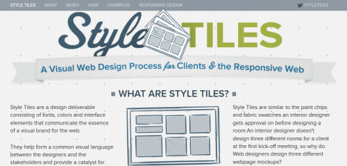
Style Tiles

“Style Tiles are a design deliverable consisting of fonts, colors and interface elements that communicate the essence of a visual brand for the web.”
responsive-design-resources13

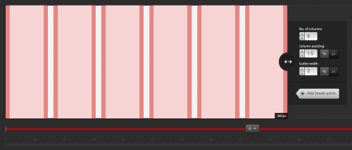
Gridpak

A fantastic responsive grid generator to make responsive design easier.
responsive-design-resources20

Sketchsheets for responsive web design

A big list of sketchsheets and tools you can use to draw out your designs in various resolutions for a range of different devices.

responsive-design-resources

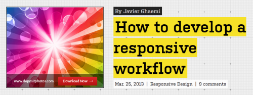
How to develop a responsive workflow

“With the introduction of RWD, it is vital that we as designers evolve our workflow to better suit the demands of the new web. Many of us have voiced our frustrations on how Photoshop’s fixed pixel approach is unsuitable for designing the fluid layouts needed for a responsive website but no useful alternatives have been offered.”
responsive-design-resources2

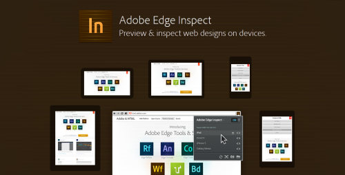
Adobe Edge Inspect

A handy tool for testing designs in different settings.
responsive-design-resources3

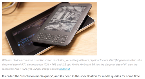
Responsive web design with physical units

“This post should be titled “Getting Ahead of Yourself.” “…By a Few Years,” actually. Here’s the deal: at the time I’m writing this, early 2013, there’s no way to accurately design for the Web using physical units, nor will there be for a very long time. But there is a way to design while knowing the physical characteristics of the device — or, at least, there will be in the very near future.”
responsive-design-resources4

The responsinator

See what your website looks like in different resolutions in real time.
responsive-design-resources5

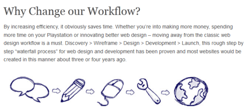
Responsive web design workflow considerations

“...as designers and developers how do we optimize our workflow efficiently? Just as responsive web design is evolving continuously, so will the responsive web design workflow.”
responsive-design-resources6

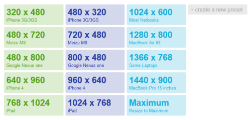
Responsive web design workflow considerations

Resize your browser to match popular devices (or choose your own size) quickly and easily.
responsive-design-resources7

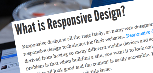
Responsive design breakpoints

A short explanation and outline of breakpoints in responsive design.
responsive-design-resources8

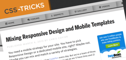
Mixing responsive design and mobile templates

“You need a mobile strategy for your site. You have to pick Responsive Design or a dedicated mobile site, right? Maybe not. Maybe you can mix and match a variety of strategies.”
responsive-design-resources9

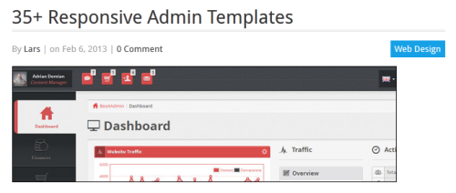
Responsive admin templates

A selection of fantastic responsive templates for admin panels and backends.
responsive-design-resources10

Responsive design: the problem with mobile ads and how it can be overcome

“But while there are many benefits to using responsive design, there are still major problems to be overcome in regards to advertising. At the moment ad formats are generally incompatible with responsive design, forcing site owners to either find hacks to rescale them or hide the ads altogether on mobile screens.”
responsive-design-resources11

The new rules of the responsive web

“As responsive web design gained steam, the way we build websites changed. As the term moves from buzzword into a common part of every web design project, the way we work as web professionals needs to change. With this in mind, we need to lay some new ground rules for how we work.”
responsive-design-resources12

Foundation

An excellent framework for responsive design.

responsive-design-resources14

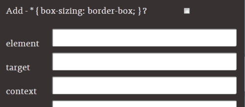
The responsive calculator

“Just a simple calculator to help turn your PSD pixel perfection into the start of your responsive website.”
responsive-design-resources15

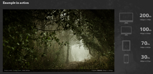
Adaptive images

“Adaptive Images detects your visitor’s screen size and automatically creates, caches, and delivers device appropriate re-scaled versions of your web page’s embeded HTML images. No mark-up changes needed.”
responsive-design-resources16

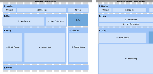
Responsive design with mockups

“Many Mockups users are doing responsive layouts on their projects or are planning to. We’ve been talking with the Balsamiq community about how Mockups can work with responsive web design concepts, and we thought we’d explore some techniques that might help.”
responsive-design-resources17

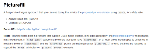
Picture fill

“A responsive images approach that you can use today, that mimics the proposed picture element using divs, for safety sake.”
responsive-design-resources18

Seamless responsive photos grid

“Let’s say you have a bunch of images you want to display, and the goal is to get them edge-to-edge on the browser window with no gaps. Just because you think that would be cool. They are of all different sizes. You don’t care if they are resized, but they should maintain their aspect ratio.”

responsive-design-resources19

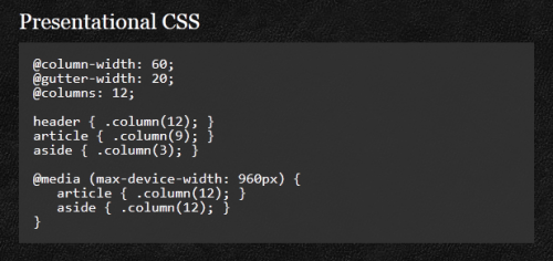
The semantic grid system

“Page layout for tomorrow. Set column and gutter widths, choose the number of columns, and switch between pixels and percentages. All without any .grid_x classes in your markup.”
responsive-design-resources21

ProtoFluid

“Rapid prototyping of fluid layouts, adaptive CSS and responsive design.”

responsive-design-resources22

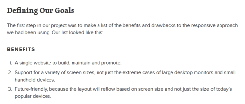
Building a better responsive website

“Earlier this year, I was in the beginning stages of a redesign for our company’s website. We had already been planning to use a straightforward responsive approach to Web design, which is our preferred solution for multi-device support…”
responsive-design-resources23

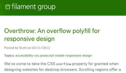
Overthrow: An overflow polyfill for responsive design

“Overthrow.js is a conservative attempt at filling the gaps in overflow support, with an emphasis on letting native implementations do their thing, and ensuring a usable experience in all browsers.”
responsive-design-resources24

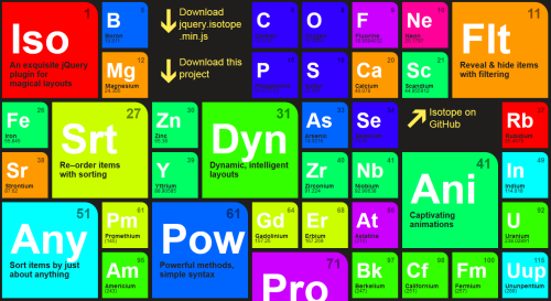
Isotope

“An exquisite jQuery plugin for magical layouts.”
responsive-design-resources25

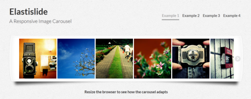
Elastislide

“Elastislide is a responsive image carousel that will adapt fluidly in a layout. It is a jQuery plugin that can be laid out horizontally or vertically with a pre-defined minimum number of shown images.”
responsive-design-resources36

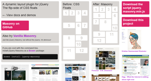
jQuery Masonry

“Masonry is a dynamic grid layout plugin for jQuery. Think of it as the flip-side of CSS floats. Whereas floating arranges elements horizontally then vertically, Masonry arranges elements vertically, positioning each element in the next open spot in the grid. The result minimizes vertical gaps between elements of varying height, just like a mason fitting stones in a wall.”
responsive-design-resources26

FitVids.js

“A lightweight, easy-to-use jQuery plugin for fluid width video embeds.”

responsive-design-resources28

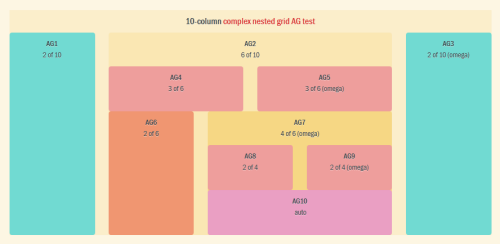
Susy: Responsive grids for Compass

“Susy is based on Natalie Downe’s CSS Systems, made possible by Sass, and made easy with Compass. You can use it anywhere, from static sites to Django, Rails, Wordpress and more.”
responsive-design-resources27

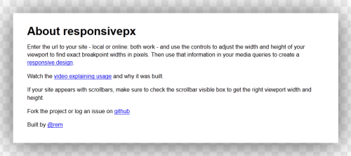
Responsivepx

“Enter the url to your site - local or online: both work - and use the controls to adjust the width and height of your viewport to find exact breakpoint widths in pixels. Then use that information in your media queries to create a responsive design.”
responsive-design-resources29

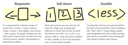
SimpleGrid

“Responsive. Infinite nesting. One class per element. Simple.”
responsive-design-resources30

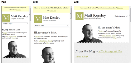
Responsive website design testing tool

“This tool has been built to help with testing your responsive websites while you design and build them.”
responsive-design-resources31

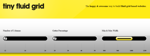
Tiny Fluid Grid

“The happy & awesome way to build fluid grid based websites.”
responsive-design-resources32

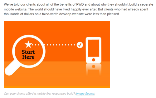
Responsively retrofitting an existing site with RWD Retrofit

“The most important question on everyone’s mind — clients and developers alike — is, “How can we provide a great Web experience to our users on mobile?””
responsive-design-resources33

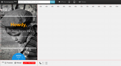
Screenqueries

Test your website’s responsiveness.
responsive-design-resources34

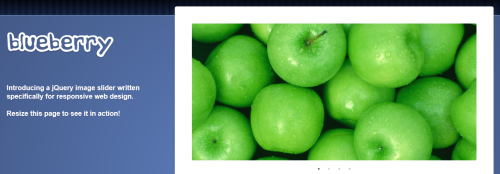
Blueberry

“Introducing a jQuery image slider written specifically for responsive web design.”
responsive-design-resources35

Responsive slides

“Simple & lightweight responsive slider plugin (in 1kb).”

responsive-design-resources37

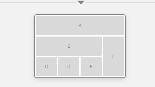
Responsive wireframes

“Responsive layouts, responsively wireframed. Made with HTML/CSS, this is a simple interactive experiment with responsive design techniques.”
responsive-design-resources38

Beginner’s guide to responsive web design

“Over the past year, responsive design has become quite the hot topic in the web design community. If all the buzz has you feeling like Rip Van Winkle waking up in the 21st century, this summary will help you catch up with the times.”
responsive-design-resources39

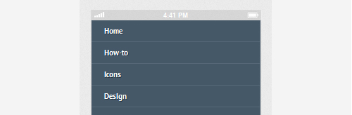
Responsive web navigation tutorial

“One of the trickiest parts to be responsified on a website is “the Navigation”, this part is really important for the website accessibility, as this is one of the ways visitors jump over the web pages.”
responsive-design-resources40


For more information about responsive website please contact us. 

If you would like to work in the freelance sector or if you would like to hire a freelance designer or in-house web designer please also contact us.

Conquest UK
Web: www.Conquest.uk.com
Email: Advice@Europe.com
Tel: 0871 910 0002
Calls cost 10p per minute + access charge

Connect
Conquest on Facebook
Conquest on Twitter
Conquest UK Google+
The Conquest UK Group Google+

Credit: Jenni Brown

9 great articles and resources to get started with web design and colour theory

Credit: Matthew Telfer

As a culture and as individuals we assign certain values, emotions and perceptions to colours. These change depending on where you are in the world, but the fact they hold a value remains.

This great chart shows how colours have different meanings around the world.

Knowing that a colour will influence a decision is key information to help you with designing your website. Here are some fantastic articles and resources to help guide you making the most of these opportunities.

A look into colour theory and web design

1 sixrevisions
Read article

5 web design colours that encourage visitors to click that subscribe button

2 1stwebdesigner
Read article

An introduction to color theory for web designers

3 tutsplus
Read article

Color theory for designers

4 smashingmag
Read article

Color theory 101

5 designfestival
Read article

Colour scheme designer

6 colourschemedesigner
Go to resource

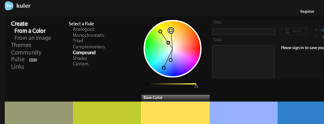
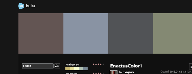
Kular

7 kular
Go to resource

25 examples of perfect colour combinations in web design

8 tympanus
Read article

The psychology of color in web design

9 vandalaydesign
Read article


For more information about working in the freelance sector or if you would like to hire a freelance designer, please contact us.


Conquest UK
Web: www.Conquest.uk.com
Email: Advice@Europe.com
Tel: 0871 910 0002
Calls cost 10p per minute + access charge

Connect
Conquest on Facebook
Conquest on Twitter
Conquest UK Google+
The Conquest UK Group Google+

Credit: Matthew Telfer

Freelance Web Designers: 5 ways to go the extra mile for your customers

Credit: Robert Mathers
First posted on 10/06/2013

The freelance web designer market is highly competitive at the moment. In 2012, we conducted a survey of 500 web designers in which 79% thought prices were being forced down due to increased competition and 4/5 believed that work was either more difficult or just as difficult to find compared to the last 12 months. With this level of competition, it’s really important for freelance web designers to find ways to differentiate themselves from others. A great way to achieve this is to provide customer service that consistently exceeds expectations.

How going the extra mile can help you

Being known for excellent service is a hugely valuable way to make yourself stand out because people will be far more likely to return for future work and there’s a good chance that they will let others know how impressive their experience with you was. This can be a big help when trying to get new clients as the 2012 Freelance Industry Report confirms by stating that the most effective ways to find and land new clients according to freelancers were referrals (chosen by 27.4% of those surveyed) and word of mouth (chosen by 23.8% of those surveyed).

It only takes a bit more effort to go the extra mile and over-delivering does not have to mean working many more hours on every project, it can be achieved simply by working smarter and thinking of ways to make life easier and to provide better results for your customers.
In this post, we’ll give you some ideas regarding what going the extra mile can do for your freelance web design business and how to go about it.

Extra Mile Map

1. Adopt quick response times

Responding quickly to your customers can help to increase trust and your perceived reliability. To make sure you stay on top of all your tasks when dealing with multiple clients, it’s a good idea to use Customer Relationship Management software because anything from forgetting a scheduled phone call to not performing significant parts of contracted work can easily upset and annoy people. To make sure this doesn’t happen, there are some brilliant CRM software packages available that are ideal for web designer users. For instance, base and StudioCloud both have free package options and come with great features to help you streamline your work processes.

2. Enable feedback and communication

When you start to work on projects for a customer, you could encourage them to engage in a dialogue with you either through email or social media so they can ask you any questions that come to them during the project. You can also use this line of communication to find out how you can help them more and, therefore, how you can make them so satisfied with your service that they never think to look elsewhere.

Feedback

3. Exceed your promises

If you promise to build a website for a customer by a certain date and then miss this deadline, this can negatively impact your relationship with them. The best thing to do is to promise things that you can definitely provide and then exceed these expectations. This is an easy way to show customers that you will over-deliver for them and to give them a memorable experience of using you.

4. Provide some extra service for free

After building a website for someone, why not finish off the package at no extra cost by setting up hosting for them, installing analytics and setting up their email addresses? These small jobs are quick and easy for you to complete and will make life easier for the customer. Offering these extras before starting to perform work for a customer can also help you to win the job in the first place by giving an excellent first impression.

5. Support your customers

If one of your customers is having problems that aren’t directly related to your work with them, try to give them some good advice anyway or point them in the direction of someone you think can give them what they need. This can be achieved very quickly but will mean a great deal to the customer, especially if their issue is causing them worry or eating up large amounts of their time. Doing this will also make them remember you long after their problem has been fixed and will show that you are interested in helping them, rather than just looking for them to pay you.

An example: Zappos

Zappos is a fantastic example of a company that consistently creates a ‘wow’ factor with their amazing customer service and they have achieved this through a range of different initiatives. For example, there is no limit to the length of customer service calls at Zappos, with the longest customer conversation to date lasting 10 hours. The company also gives you up to an entire year to return an item if you are not happy with it and their shipping is free and often done overnight. Zappos understands that high quality customer service involves developing a long term relationship; this is why they will search three different competitors’ websites and direct customers to those competitors if they do not have the requested item in stock. The benefits of this approach have been clear, with the company reaching $1 billion in sales after only eight years of trading and the fact that 75% of their customers are repeat customers.


For more information about working in the freelance sector or if you would like to hire a freelance designer, please contact us.


Conquest UK
Web: www.Conquest.uk.com
Email: Advice@Europe.com
Tel: 0871 910 0002
Calls cost 10p per minute + access charge

Connect
Conquest on Facebook
Conquest on Twitter
Conquest UK Google+
The Conquest UK Group Google+

Credit: Robert Mathers